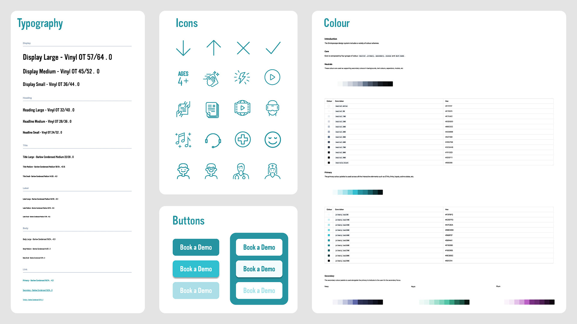
Typography - sizing based off Google Material Design 3 and setup as styles
Icons - custom designed icons to suit audience and brand, setup as components
Buttons - primary and secondary buttons with active, hover and disabled states, setup as components
Colour - used brand colours and found tints and shades, listed hex code and setup as styles
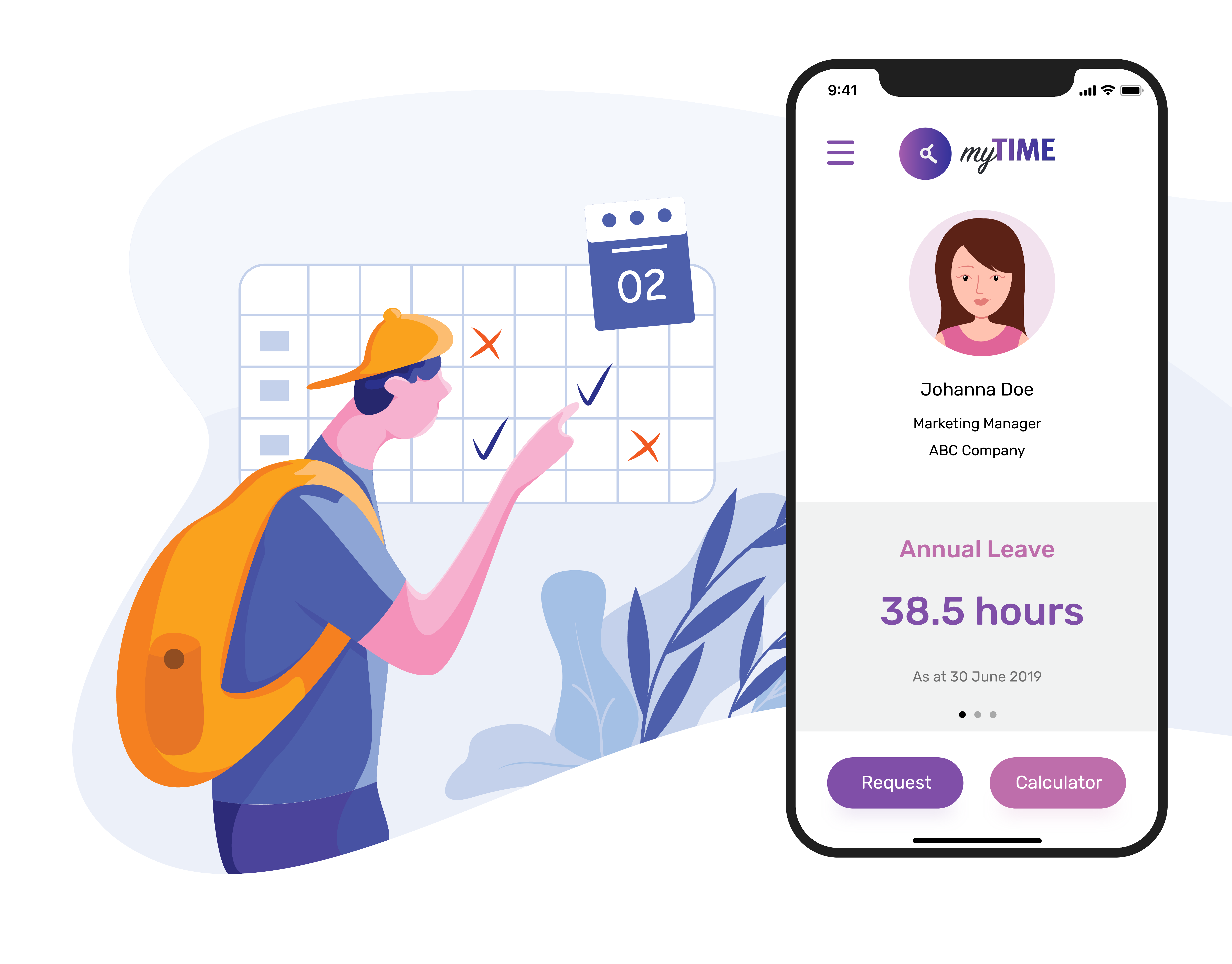
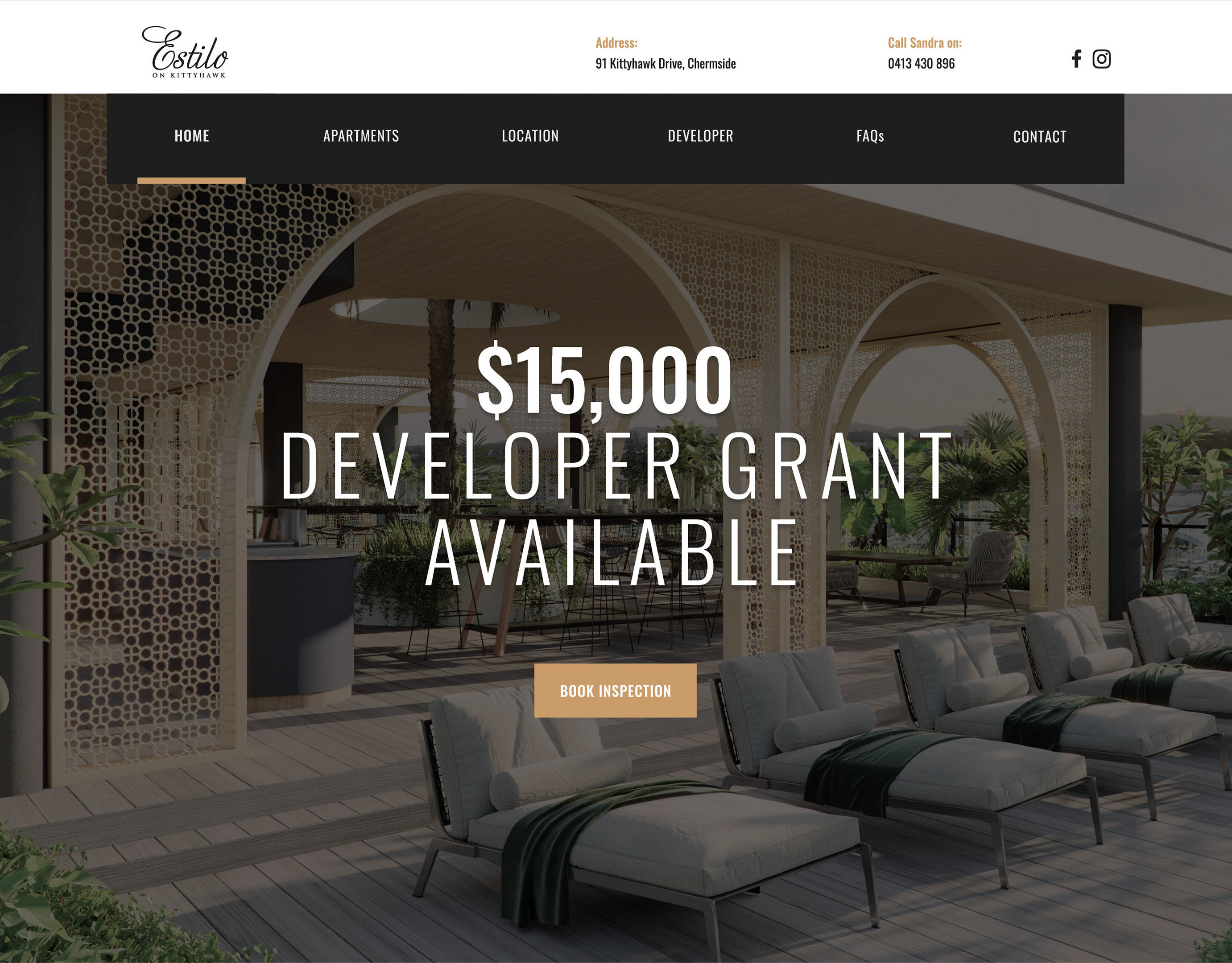
Using Smileyscope's design system I have designed their application home page UI above and website below.